Nestled in Armitage Bridge, Huddersfield, Brooke’s Mill stands as one of Britain’s oldest businesses, passed down through generations from father to son. With origins dating back to 1541, the site has long been home to a variety of enterprises, embodying a rich history of industry and community.
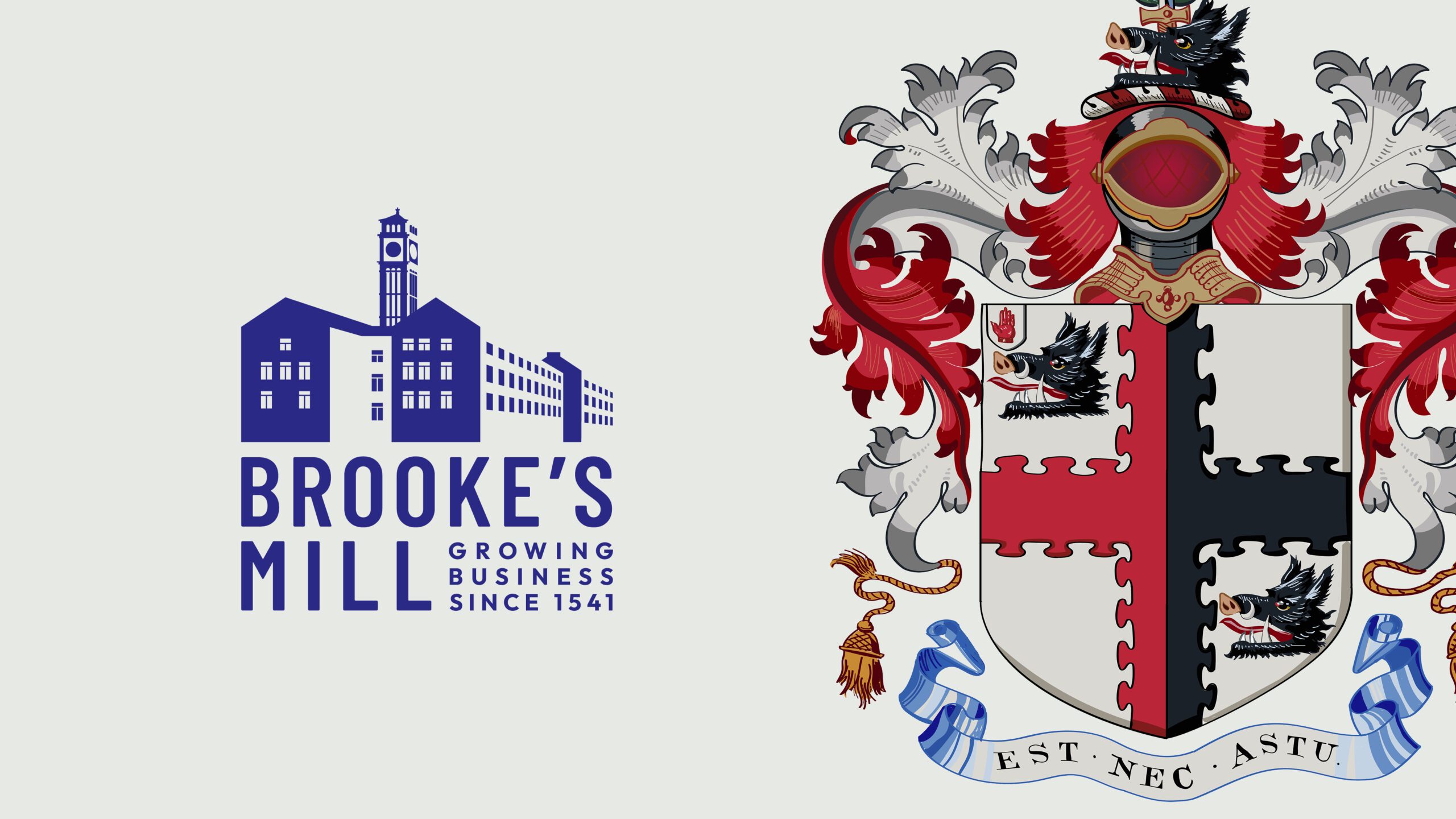
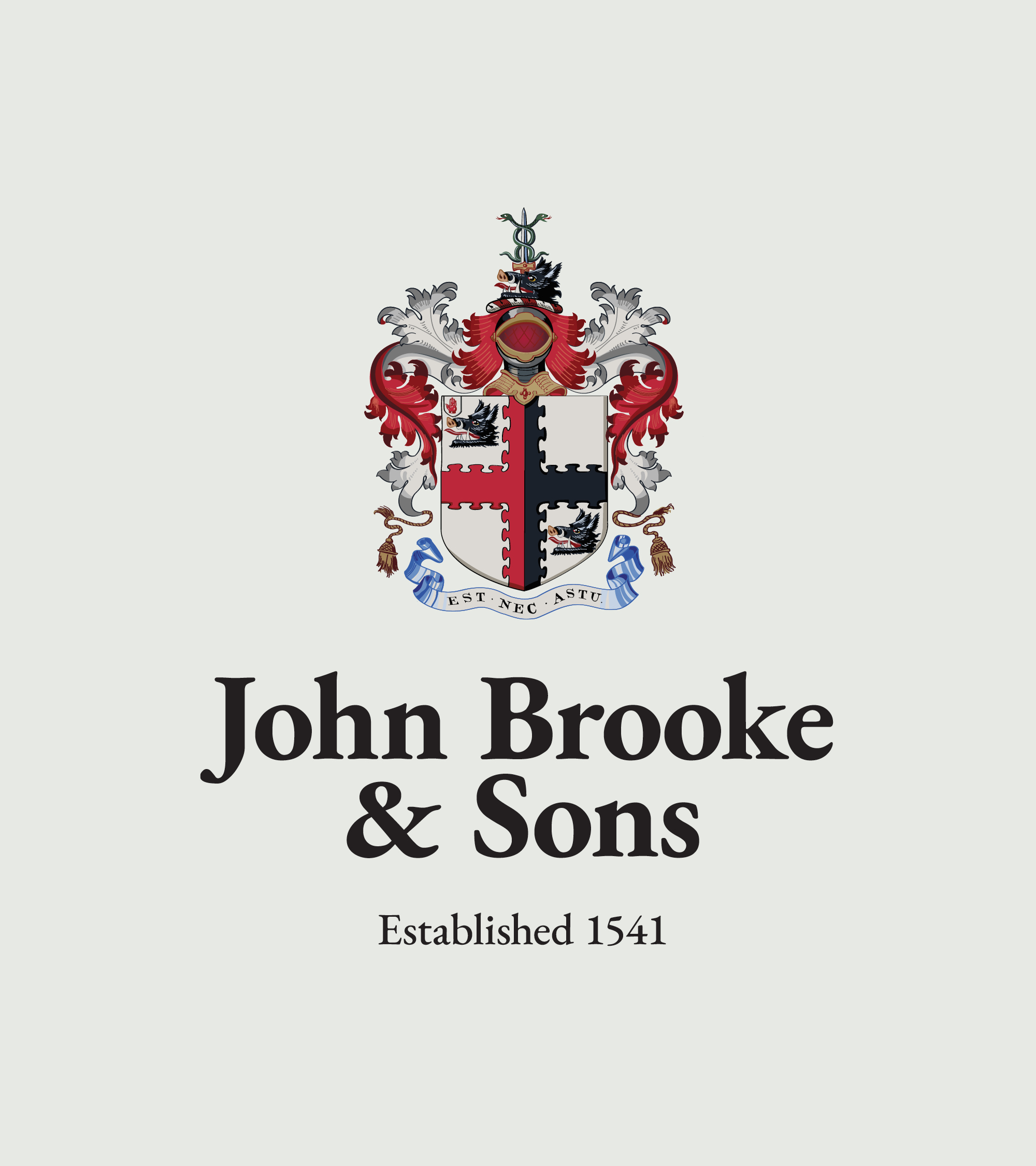
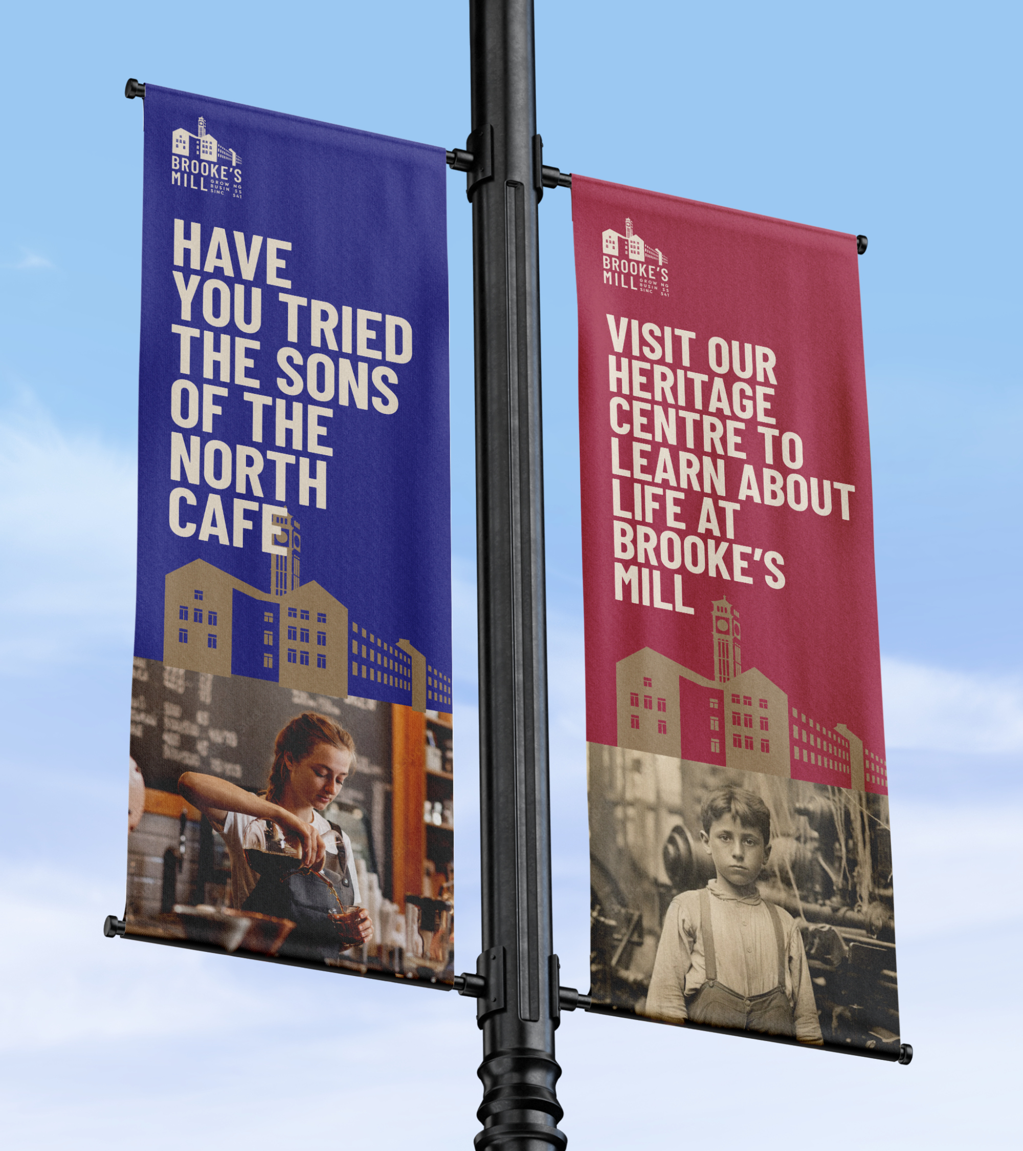
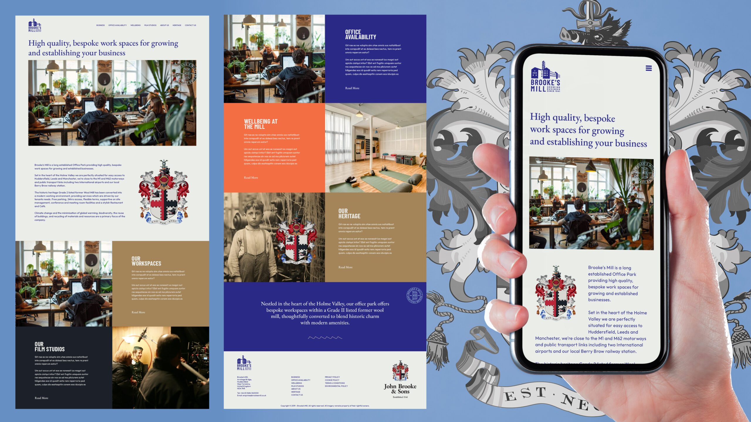
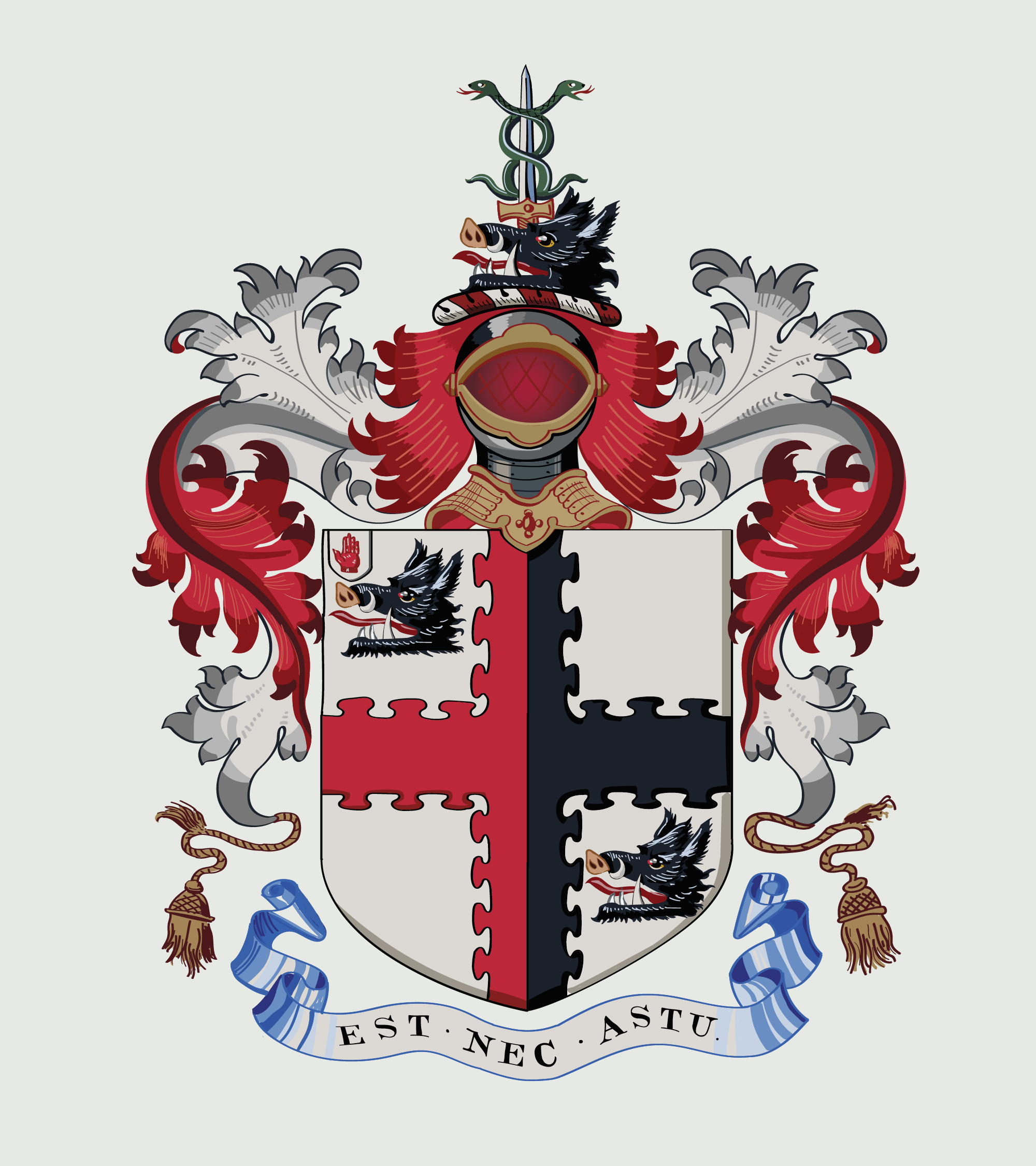
In the summer of 2024, NWDI had the privilege of rebranding Brooke’s Mill, realigning its identity to reflect its heritage while paving the way for its future. As part of this rebrand, we also redrew the John Brooke & Sons family coat of arms as a vector graphic. Previously, the coat of arms existed only as a printed piece in the mill’s museum, making this a significant step in preserving its legacy for modern use.
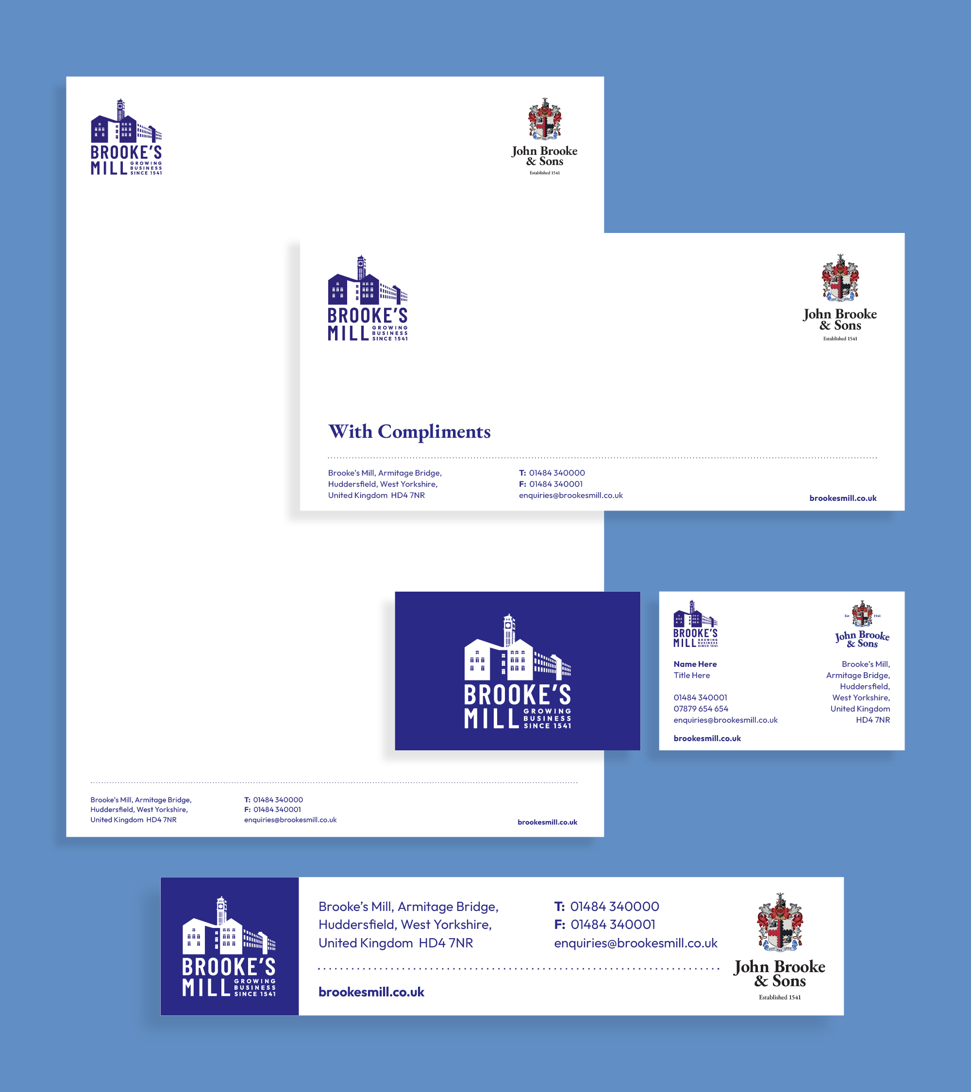
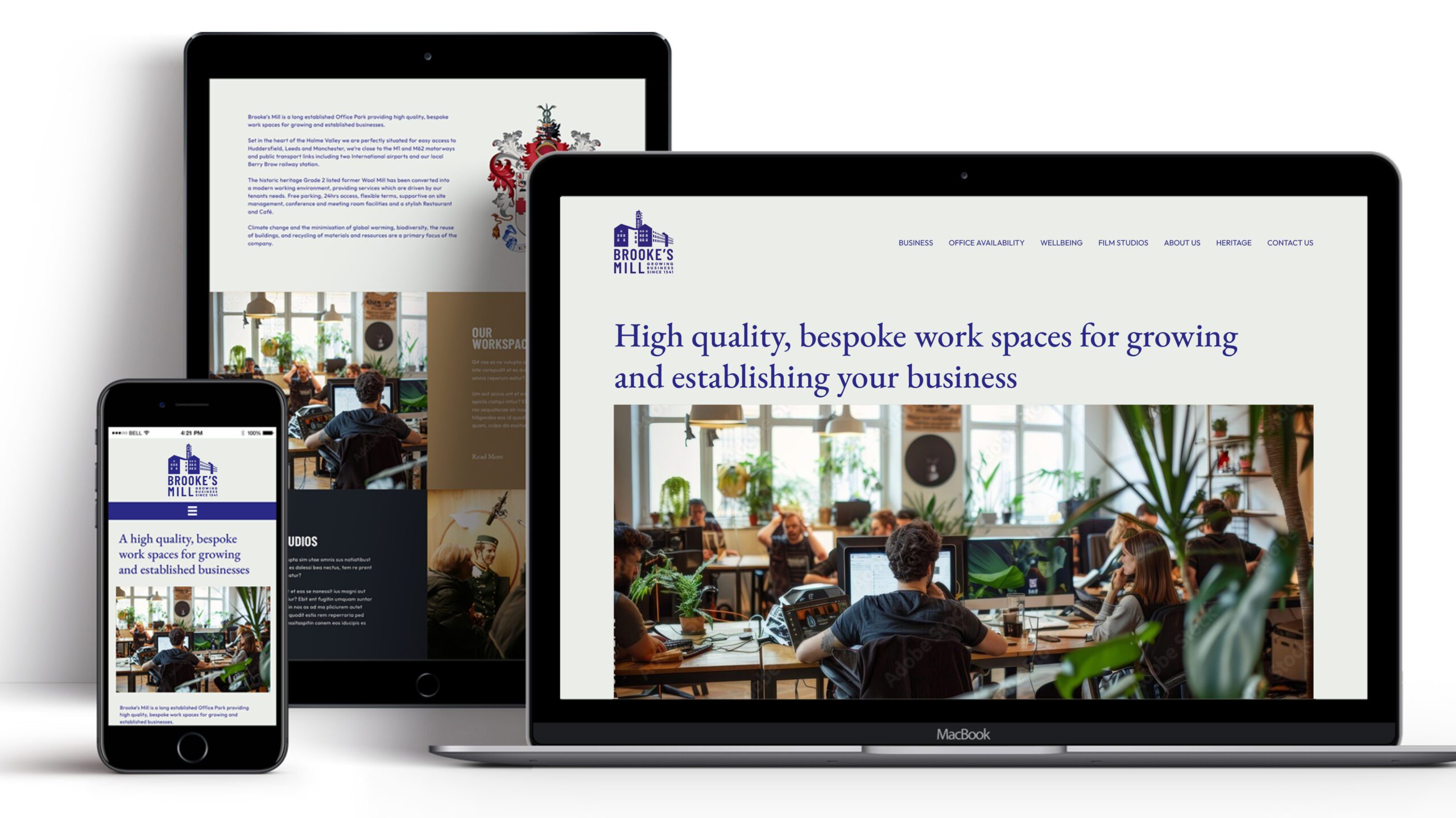
To guide the rebrand, we researched similar heritage businesses across the country to gain insight into how to contemporise the identity while honouring its roots. Brooke’s Mill had been using multiple logos across its materials, leading to inconsistency. Our goal was to unify the brand under one cohesive identity system.
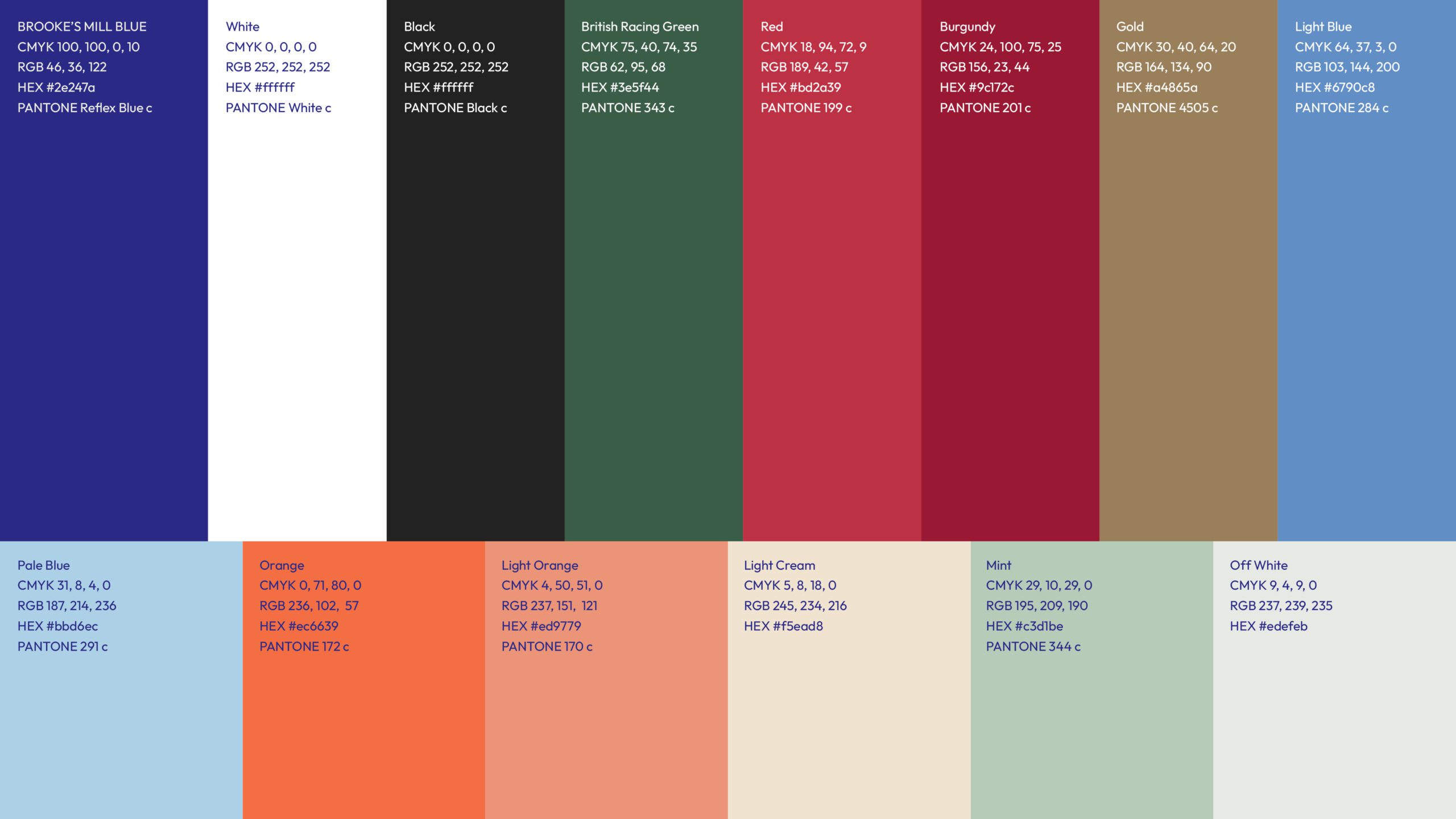
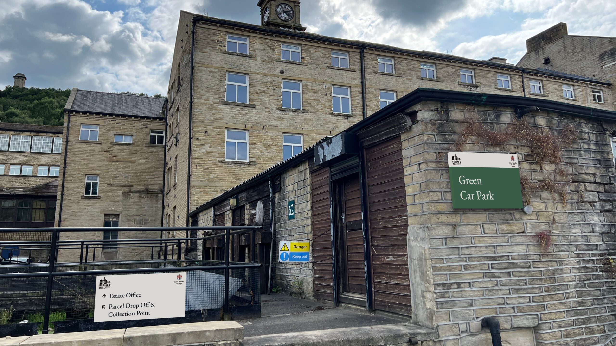
We introduced a refreshed colour palette inspired by the family coat of arms, bringing vibrancy and continuity to the branding. The business’s typography system was also revamped, ensuring it was both highly legible for wayfinding and signage around the site, and versatile enough to work seamlessly in print and online applications.
The new identity pays homage to the iconic building’s silhouette and clock tower, visible from Castle Hill, which are defining features of Brooke’s Mill. The typography subtly enhances the previous design, striking a balance between modernity and heritage. This thoughtful evolution of the brand ensures that Brooke’s Mill retains its historic charm while presenting a strong and cohesive image for the future.