Situated in the industrious locale of Brighouse, West Yorkshire, GR Steel stands out as a family-owned tool steel distributor, proudly extending their exhaustive product offerings to customers nationwide.
When approached to sculpt a new identity for the business, the imperative wasn’t merely to alter but to enhance, ensuring the retention of vital elements that resonated with their legacy. The tulip graphic, an emblematic component of their previous identity, carried with it a depth of meaning and was thus seamlessly woven into the new design, preserving the cherished continuity amidst change.
Striving for simplicity and elegance, we devised a refined version of the graphics and conjured a bespoke type identity to gracefully complement the tulip emblem, nurturing a harmonious visual symphony.
With the new identity beautifully crystallised, GR Steel was presented with a complimentary type kit and an industry-aligned colour palette, engineered to visually echo their robust and dynamic sector.
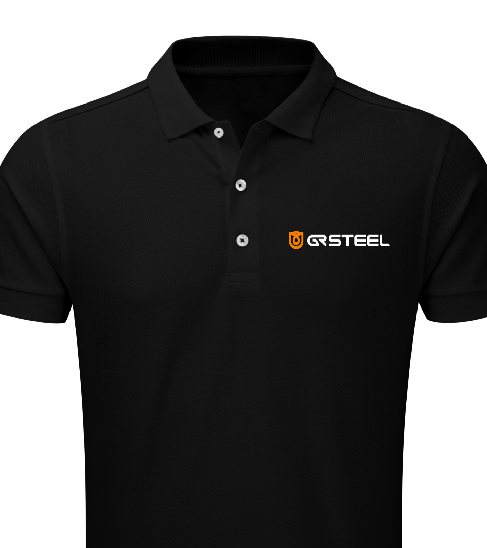
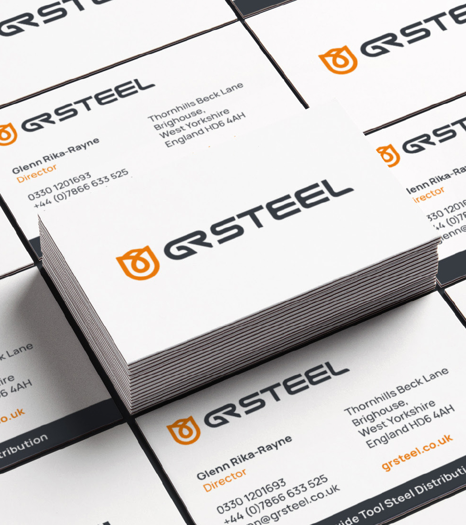
Our collaboration unfolded further as we crafted new graphics for their Twitter pages, meticulously designed business stationery, and introduced branded workwear, imbuing every touchpoint of their brand with this rejuvenated identity.
Now, GR Steel proudly brandishes an identity that not only simplifies its usability in varied applications but also amplifies its visual appeal across all signage and business materials, elegantly bridging their rich history with a vibrant, forward-looking aesthetic.