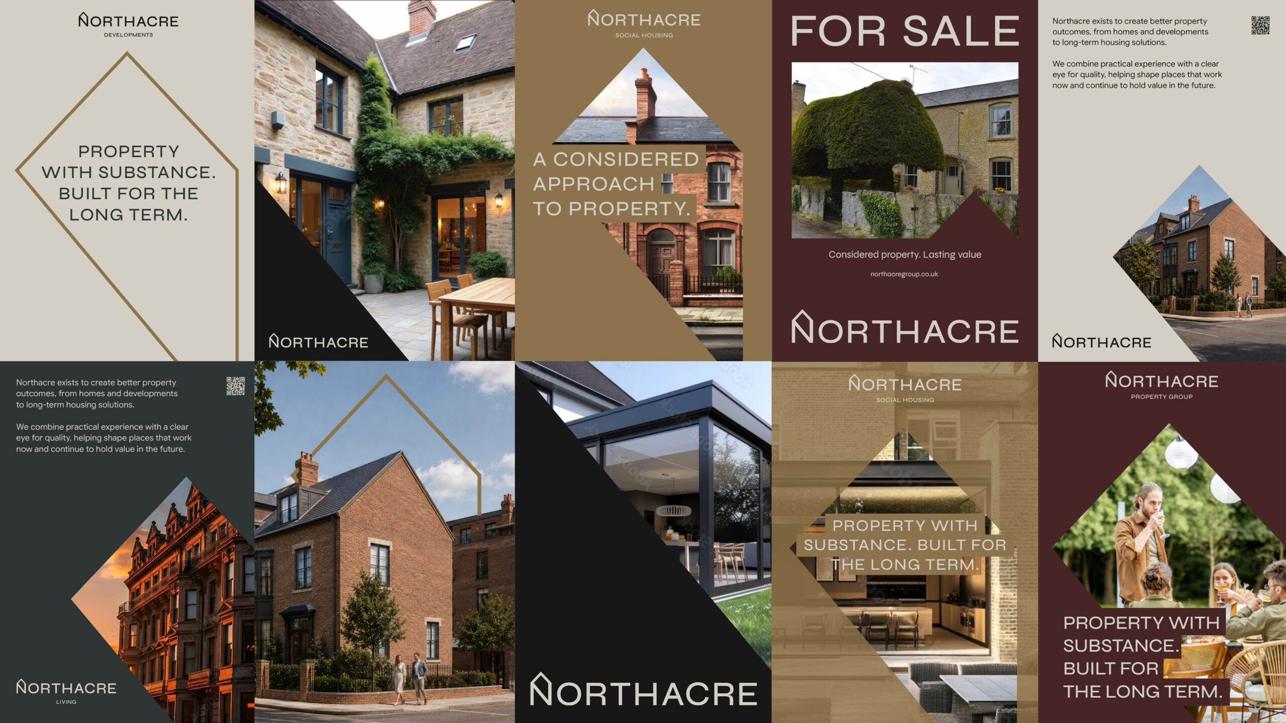
A buyer might first come across Northacre on a ‘For Sale’ board. An investor might get to know the business through a pack they can sit down and read. When we started working with Paul on the branding for Northacre Property Group, we had both of those people in mind.
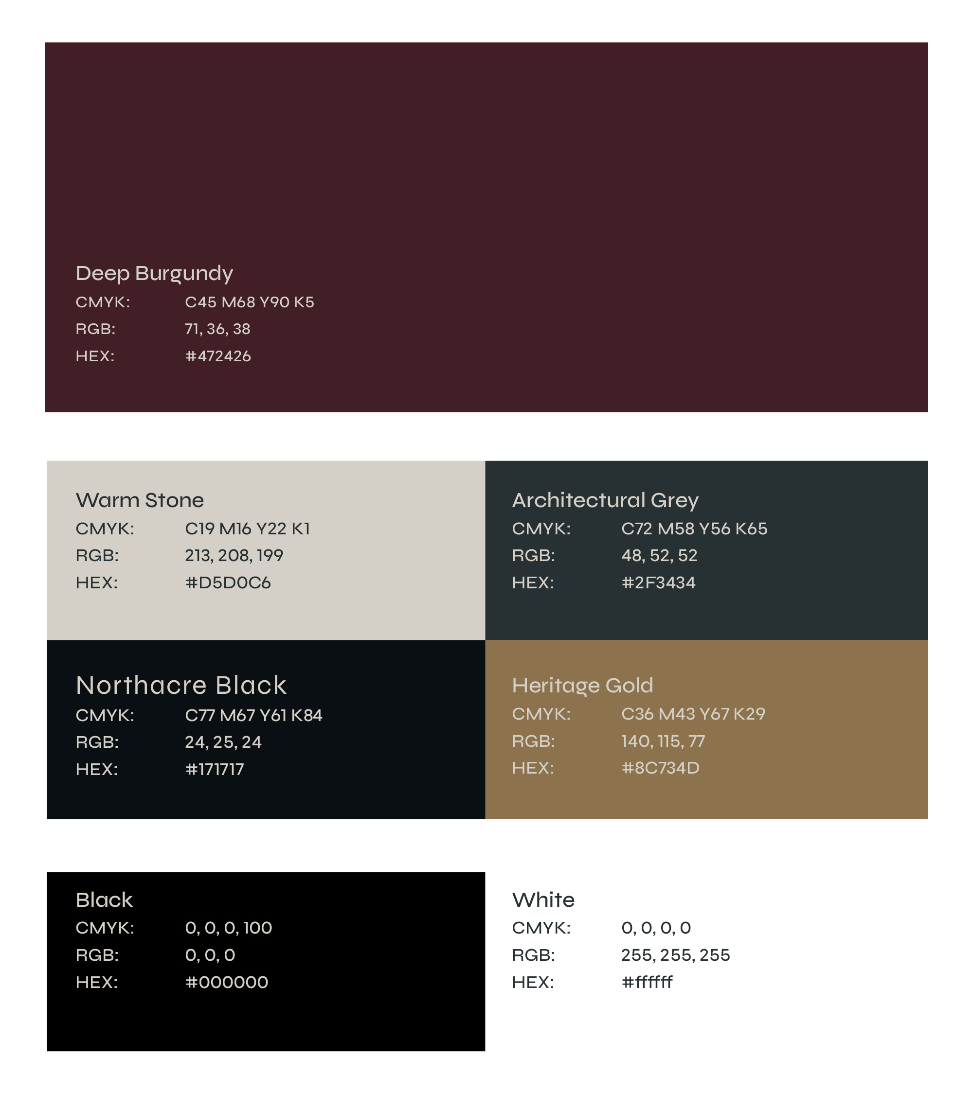
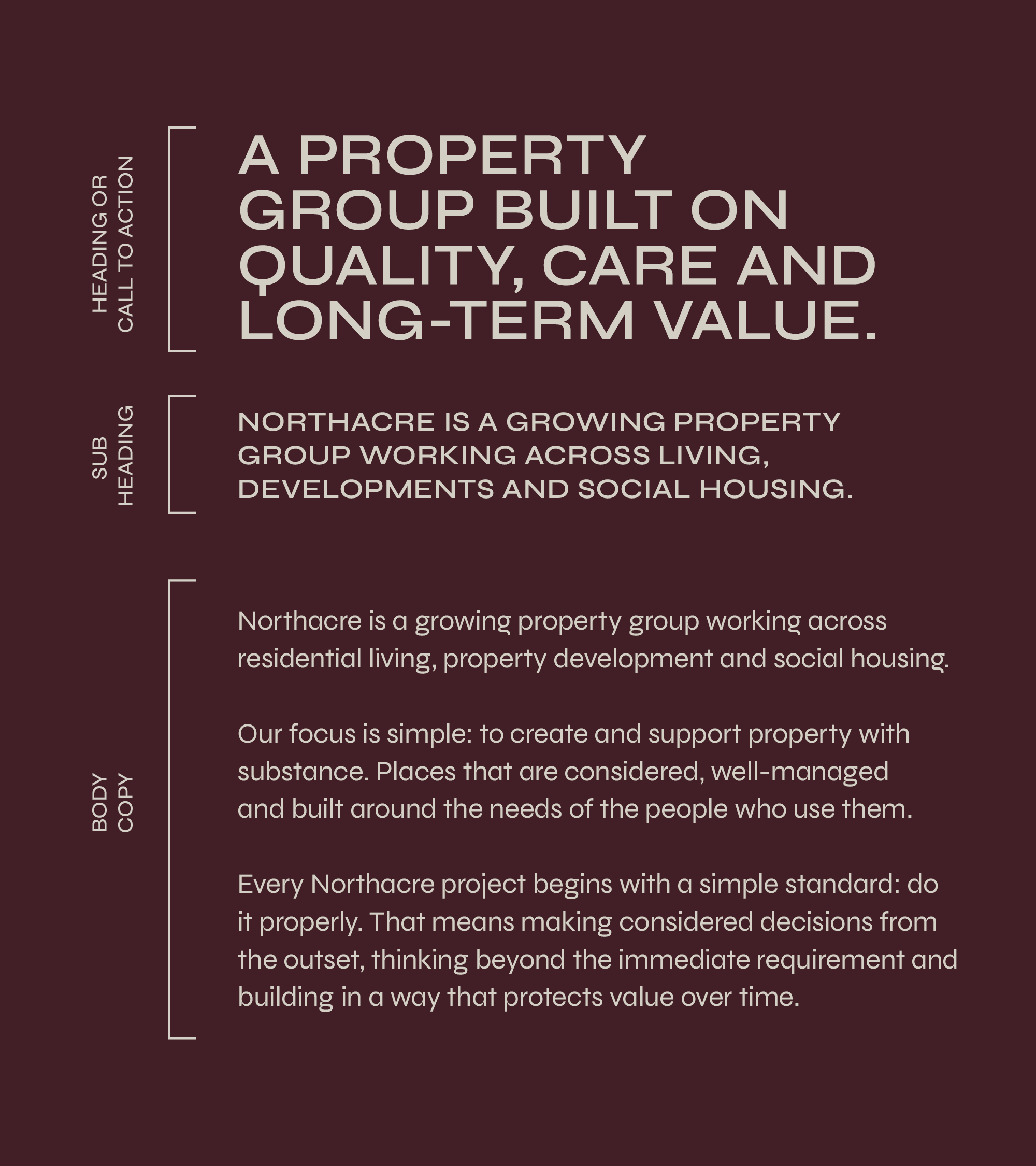
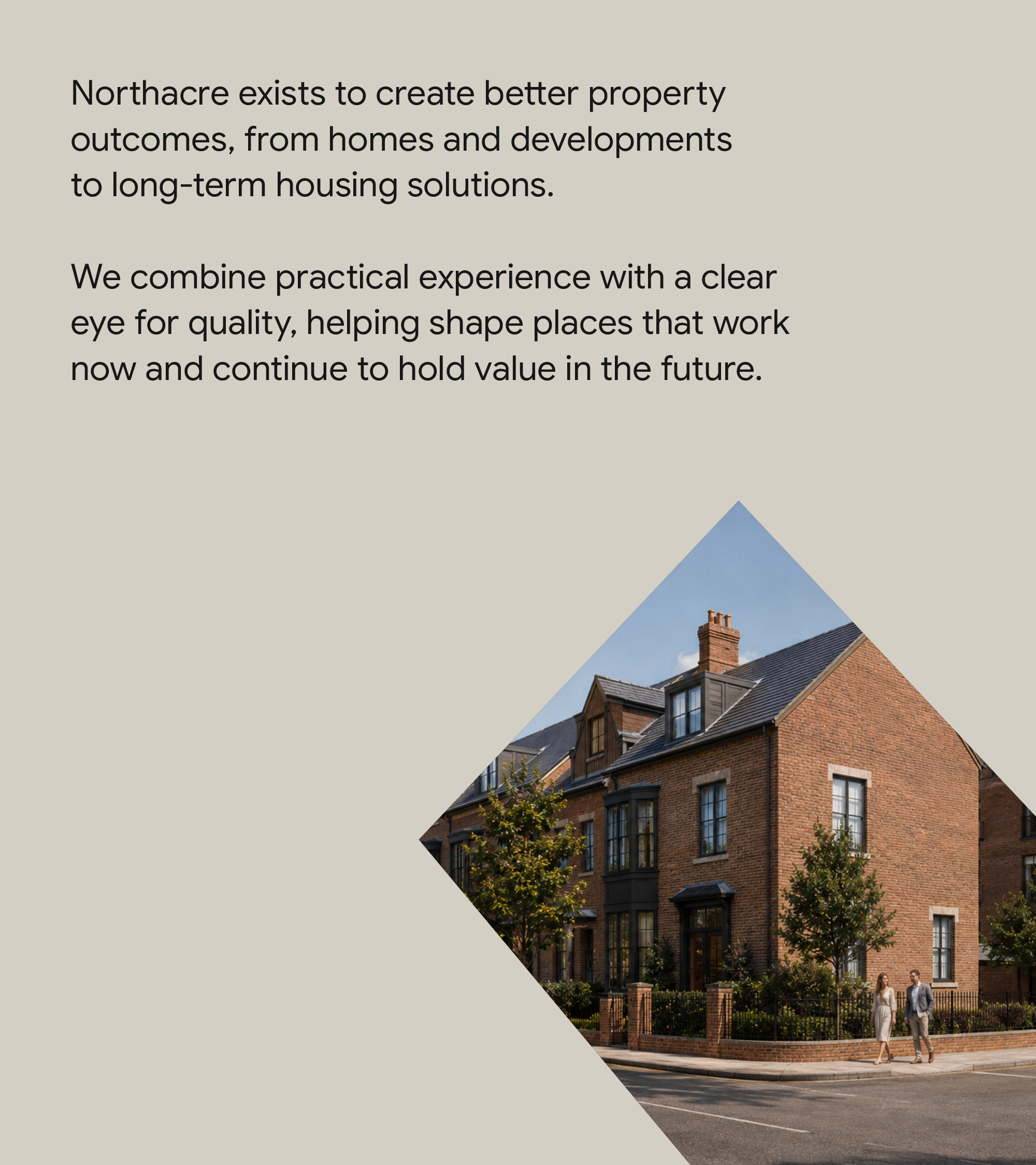
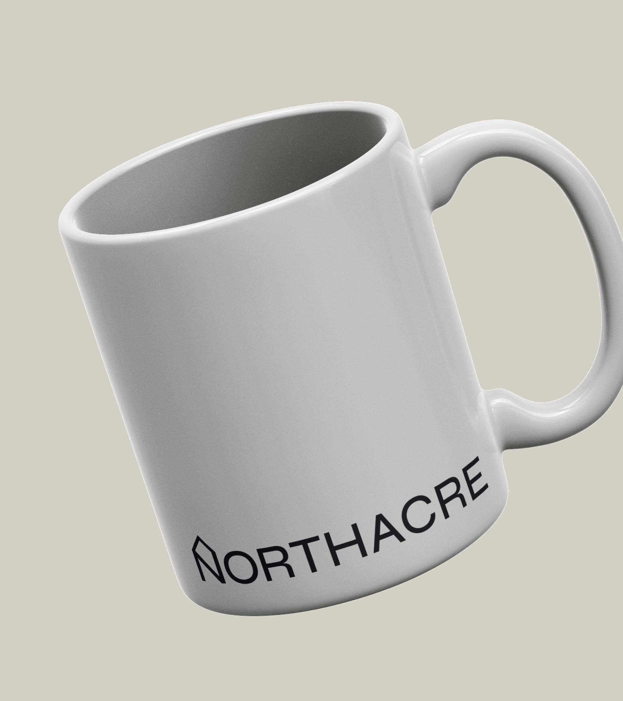
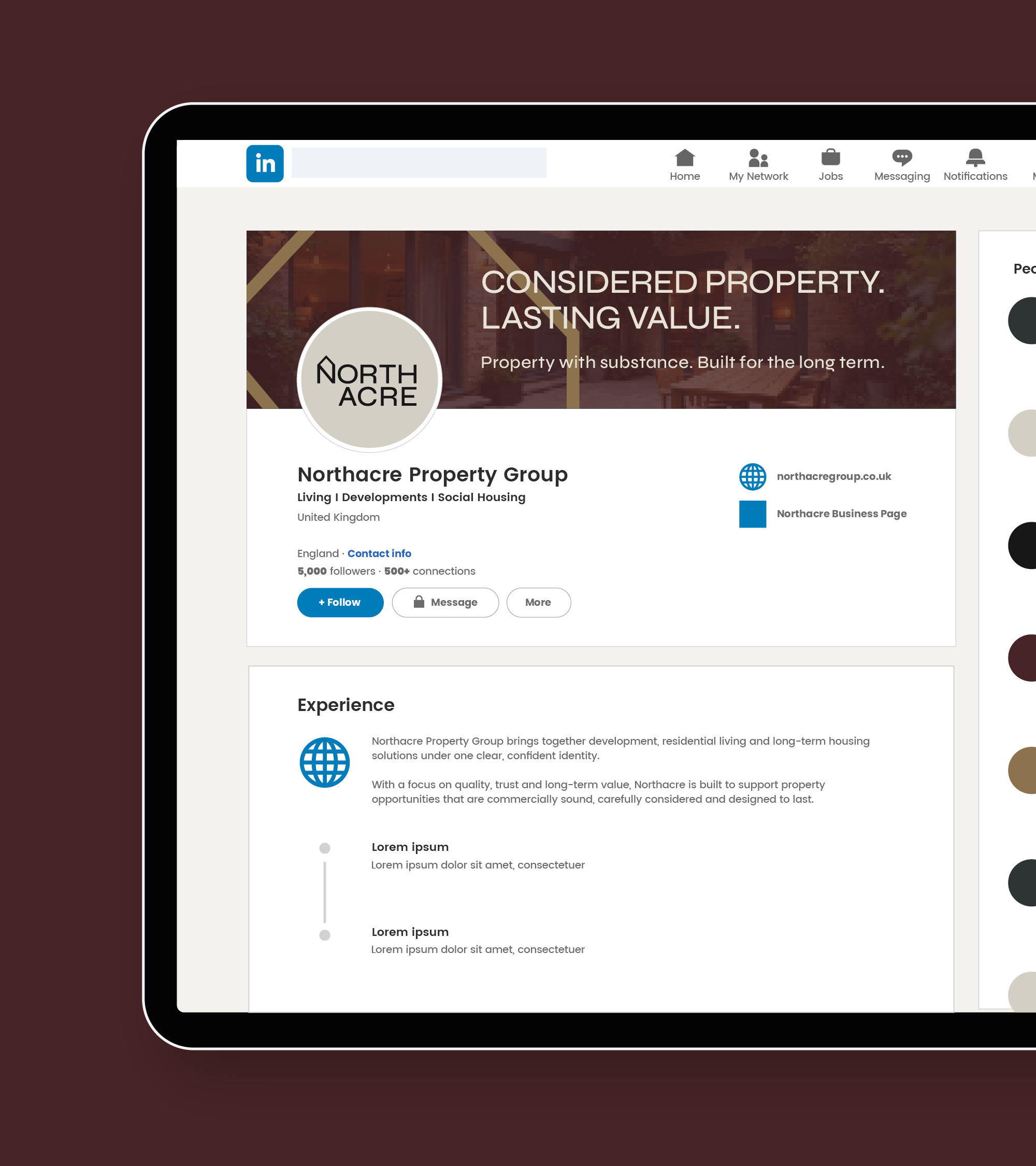
The project began with the brand identity. Working from our design studio near Huddersfield, West Yorkshire, we developed the Northacre logo, colour palette and typography. We brought these together in a set of practical brand guidelines so that, as new properties come along, the team has a clear starting point for everything they put out.
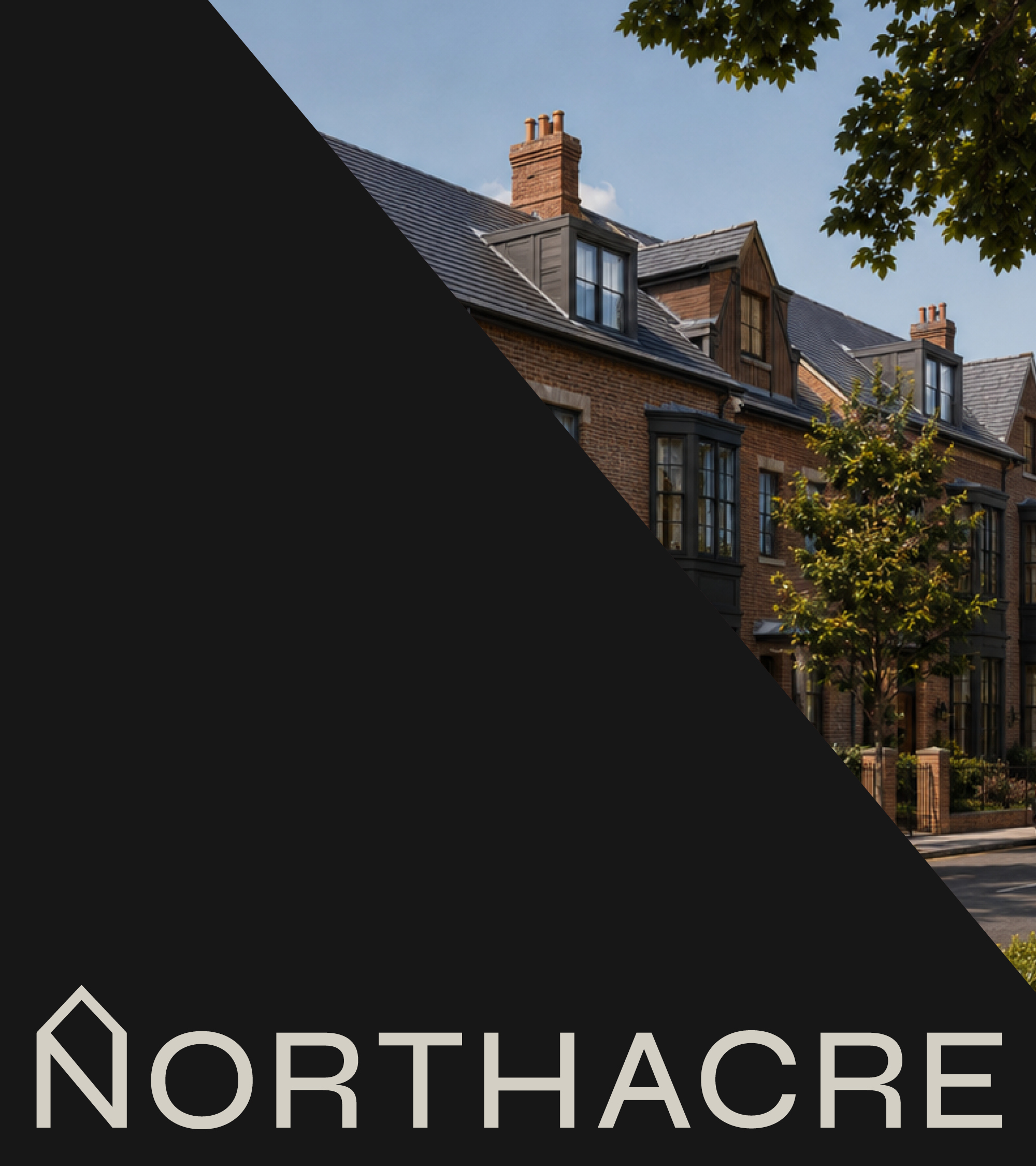
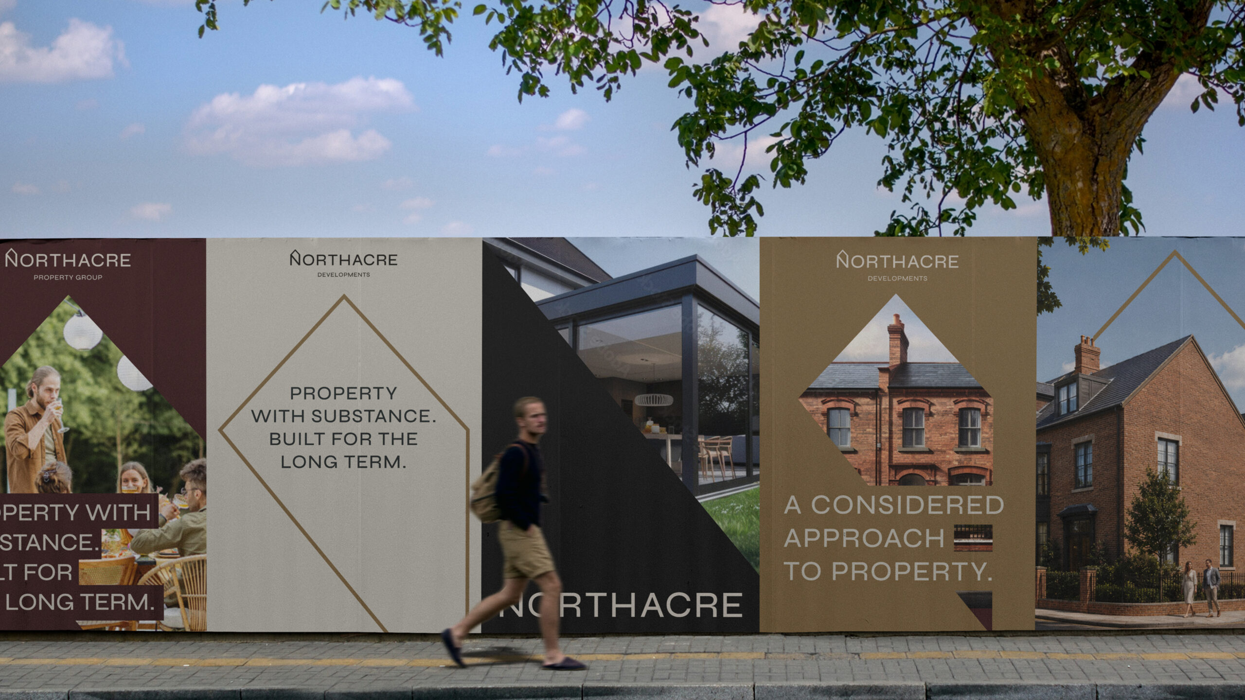
From there, we took the identity onto site, designing development hoarding and ‘For Sale’ boards. This is where scale really comes into it. Someone passing a site has seconds to take in the name, so we gave Northacre room to stand out and kept the information easy to read at a glance.
The investment pack gave us a different design challenge. Here, people have time to look through the details. We carried the same colours and type into the page layouts, giving each section a clear order so a potential investor can find their way through the pack.
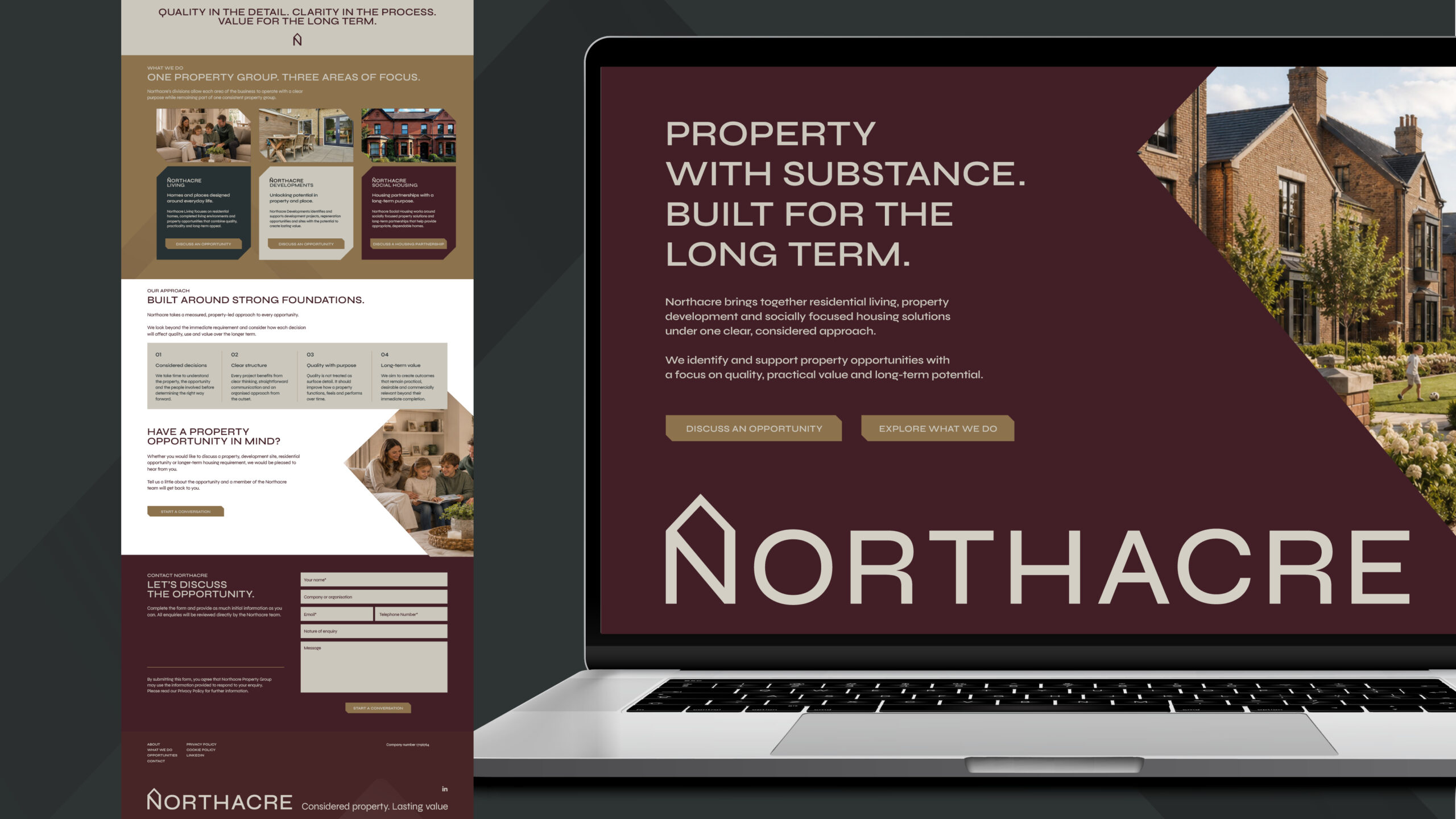
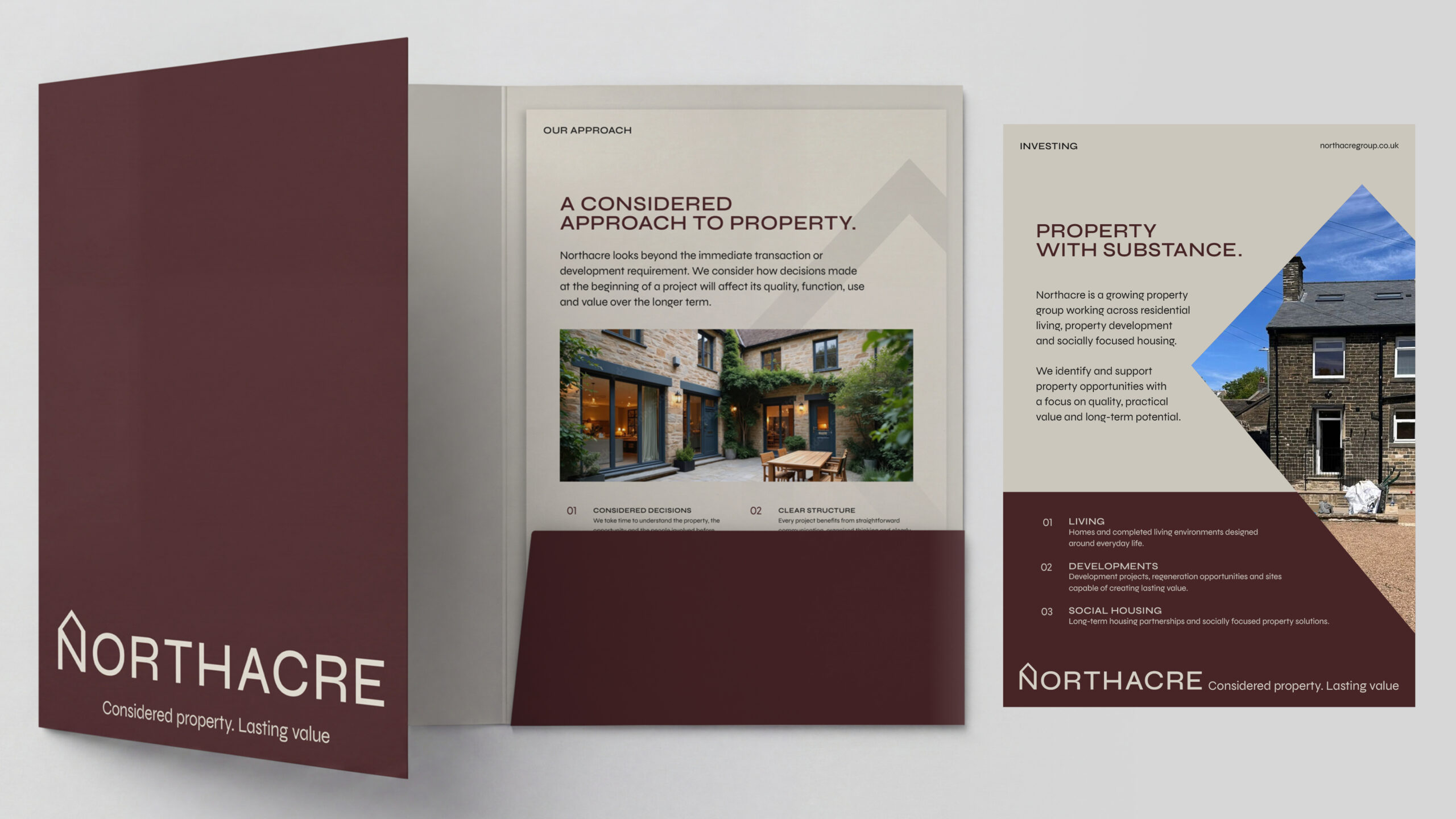
We’re now carrying the branding through to a corporate presentation folder, property data sheets and a website holding page, with final copy and photography still to come. What started as a brand identity design project has given Northacre a consistent way to present the business, from the board outside a property to the paperwork Paul can leave behind after a meeting.