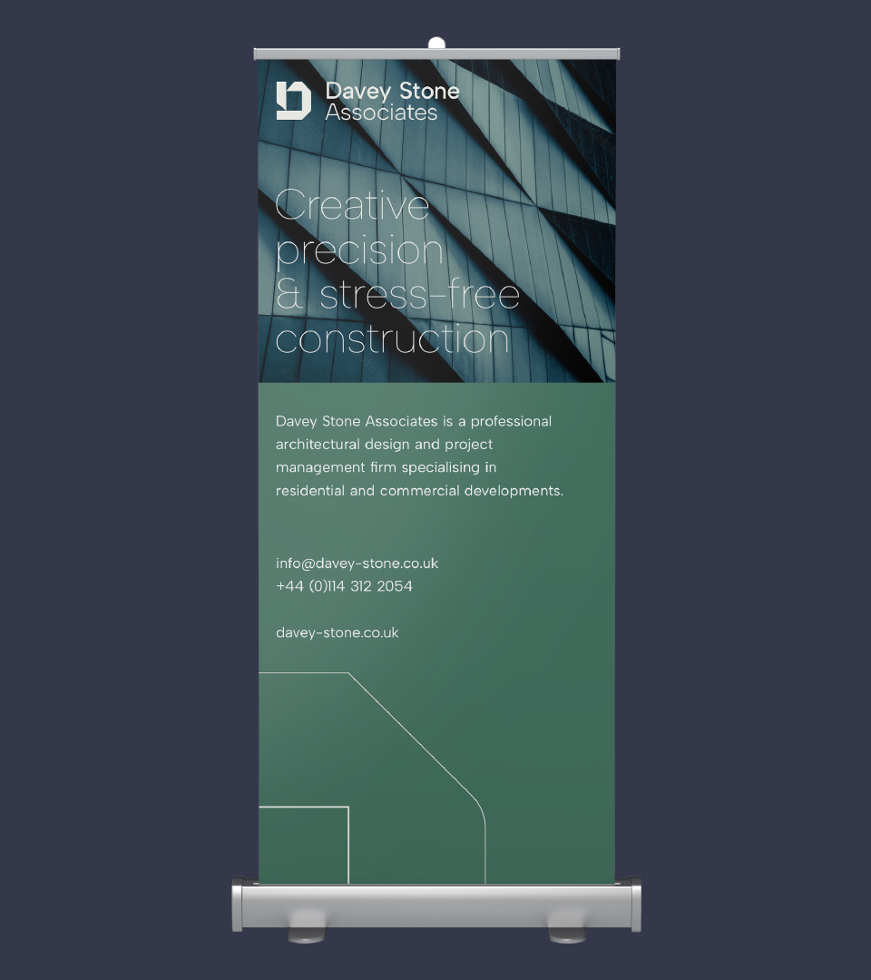
Davey Stone Associates is a professional architectural design and project management firm specialising in residential and commercial developments.
The company, which has been operating for several years, recently embarked on a rebranding journey to better reflect its evolving identity and ambitions. Using a detailed brief gathered by Lisa, combined with research conducted by McLaren & Co Marketing and direct client consultations, I helped shape the practice’s new brand identity.
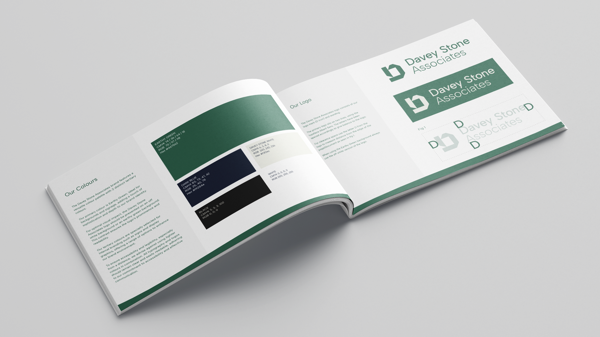
The rebranding process began with sketches to develop a logo mark that would symbolise the firm’s values and services. The “D” icon is designed to represent a top-down view of a building plan, creating distinctive, acute angles that give the logo mark a unique, memorable quality. This design not only differentiates Davey Stone Associates but also serves as a versatile graphic element.
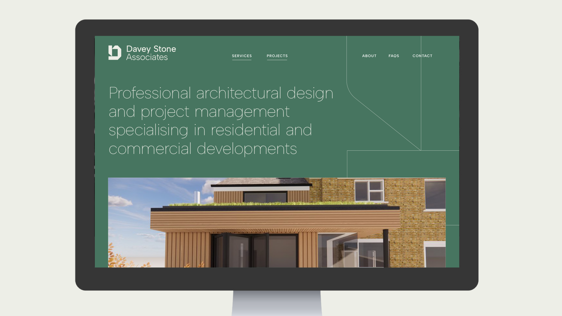
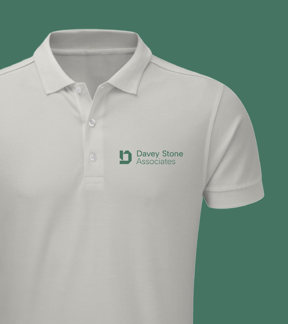
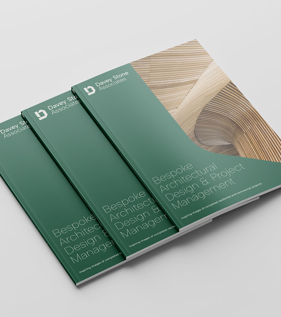
The logo mark’s shape allows it to be used across various touchpoints—website, brochures, display materials, and wayfinding—ensuring a cohesive and recognisable presence.
In addition to the logo, we developed a custom colour palette and typography set to give Davey Stone Associates a distinct look that aligns with the client’s vision for the future. This comprehensive brand identity provides a strong foundation as the firm continues to grow and engage with new projects.